This first exercise is to get you started on taking pictures... Lots of pictures. Or if you already have lots, then sort them into the three categories. The idea is to take pictures of Design Elements, so you have to pay careful attention to composition.
Take about 100 shots of a combination of anything that has Color, Texture, or Pattern, as the primary focus of the picture. They may and often overlap each other, as sometimes for example a certain texture on a wall may have a vibrant and interesting color on it, etc.
I'd like to post YOUR best results here. So please post me a link to your photos for this exercise and also for future exercises.
Here are just a few examples:
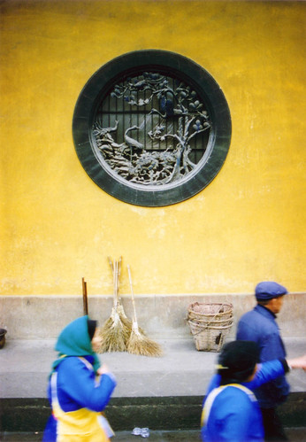
Taken in a temple in China (if I remember correctly, around Hangzhou). I was first interested in the bright yellow color of the wall and its contrast with the people swirming around wearing blue. Then I found this elegant circular carving on the wall. I wanted to juxtapose that stillness beauty with the moving images of the people.
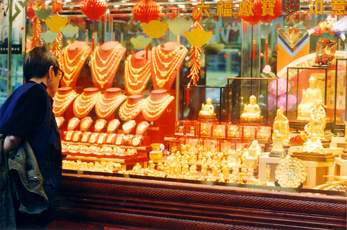
HongKong, the land of wealth. The colors of gold and red say it all.
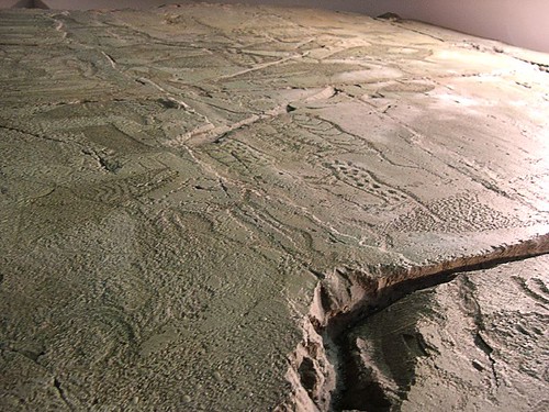
An interesting old relief from a cave. Taken in a Museum in GyeongJu, near Busan, South Korea.
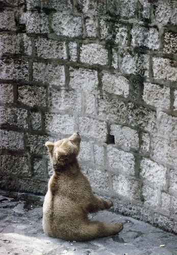
Poor animal captivated in a zoo. The rough texture and composition suggest the mood of the situation (Beijing).
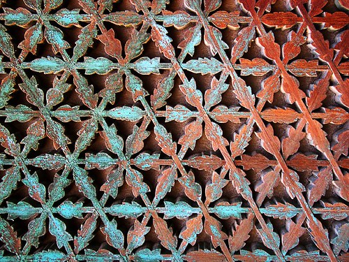
Old traditional sites provide lots of interesting and very often intricate patterns. This one also has nice weathered colors (GyeongJu).
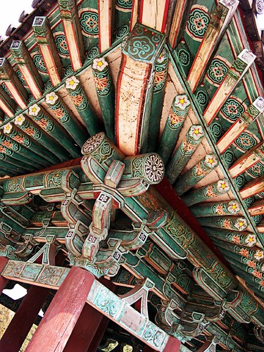
Same goes with this one of a traditional roof top/ceiling.


|