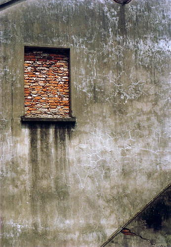
Continue the Design Elements exercise with Line, Shape, and Form. Take about 50 pictures for this one, then choose 10 of your best. You may sort out your old photos or better yet, take new ones. Lines may be straight, curvy, diagonal, in repetition, etc. The simple difference between Shapes and Forms is that Shapes are 2 dimensional and Forms are 3 dimensional, showing more shadows and highlights that show depth and mass. The most basic shapes are usually silhouette pictures, but try to find others.
But please remember that I'd like to post YOUR BEST PHOTO results here. So feel free to post me a link to your photos.

Besides in silhouettes, shapes can be found in many places such as walls or building parts. Try to find geometry in things and build a composition from that. Always remember the Rule of Thirds. Photo taken in a village close to Beijing.

Forms can be found in all things that provide information for it, such as shadows and highlights to show depth and volume or mass. But this photo also shows form from the wire-frames or the grids that lit up from the inside of the lampions. This picture was taken from a lampion festival in Laguna, Surabaya.


|