 "Seven Kinds" by xp07 Kevin Winaldy (04)
 "Evalagus" by xp07 Yohan Ariel (04)
 Untitled by xp07 Heru Wibowo (04)"Seven Kinds" by xp07 Kevin Winaldy (04)"Evalagus" by xp07 Yohan Ariel (04)Untitled by xp07 Heru Wibowo (04)
I got this from trendhunter recently.. The artist used various textures of human skin and pieces of various faces to compose the image. The result is frightening impressive. Take a look at the making process of Jessica Rabbit below.

 Human cartoons are realistic interpretations of famous cartoon characters. In this case, we have Homer Simpson, Mario, and Jessica Rabbit in the flesh.
The artist, who goes under the name Pixeloo, writes on his website, “There isn’t really a strong reason I’m keeping this anonymous, I just kinda decided before I started that that’s how I wanted to do things. I work with Photoshop almost daily in my profession. I don’t feel like I get to have much fun with it lately though and this is my outlet.” 


 Photography: Caesar Lima, Digital Imaging: Felipe Silva, Client: Sebastian International, Durso Design
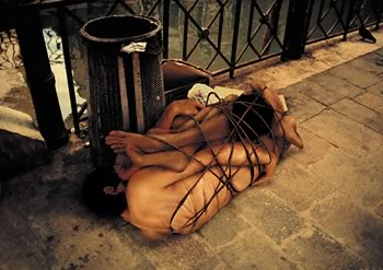
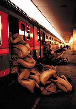
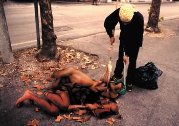
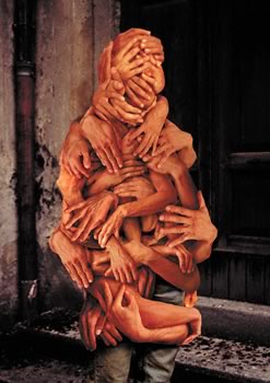
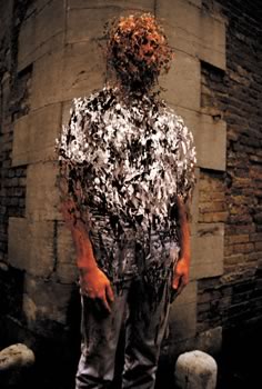
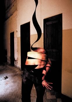
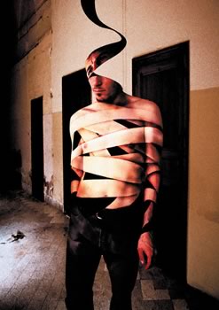
Here are some samples of the work of Tetsuya Tamano.
Tamano Tetsuya developed this body of work during his residency at Fábrica, Benetton’s communication research and development centre. When asked to develop a visual project to depict his view of contemporary society, Tetsuya came up with these strong and often disturbing images; he worked using digital technology, so as to better express his world views, and in keeping with Fábrica’s philosophy, in its role as an applied creativity laboratory (its name comes from the Latin word meaning workshop), of experimenting with new forms of communication.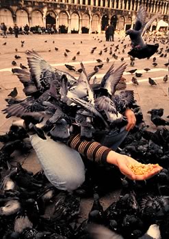

 Visiting Lecturer Jeffrey Sebastian (2003 graduate of Petra's Visual Communication Design major /DKV'99), who's currently a digital creative freelancer, gave a showcase of his works yesterday in class, and revealed a recent project and case study from client Star Mild's ad agency. You can see his resume and some of his works on his site at creativetrees.com.
This will be followed later this semester by a three-day Digital Imaging seminar and workshop scheduled in the end of May. The event will bring in some of the top photographers and digital creatives from Jakarta to explain and demonstrate to us about the DI industry and also the whole process from planning to execution. The seminar will be open to the whole Visual Communication Design department. The 2-day-workshop, however, will be limited to the XP Class.
Not exactly a true IR, but it gives you a similar feel. Give it a try.
I've found that Photomatix’s alignment wont work properly in itself. This means that the option below it, which is “Attempt to reduce ghosting artifacts” must always be checked also to get the best result. Like so...
Here is an example of alignment WITHOUT the Attempt to reduce ghosting artifacts:

 You can see above at the HDR viewer window that the alignment isn't perfect.
 Here the alignment is much better.


