"The illiterate of the future will be the person ignorant of the use of the camera as well as of the pen." -Laszlo Moholy-Nagy, 1936
Thursday, November 6, 2008
Monday, October 27, 2008
Faceless Photos
 Faceless Photoshoots - Recontextualizing the World With Melanie Bonajo (GALLERY)
(TREND HUNTER) Melanie Bonajo says that her ideas are “link jingles” in her head. What are your ideas like? In order to make sense of the jingles she has in her head, Melanie Bonajo gives them structure. She questions… [More]Modern Ghost Towns
 Modern Ghost Towns - 10 Recently-Abandoned Cities (GALLERY)
(TREND HUNTER) Abandoned cities, towns and villages abound all over the world. And I’m not talking about ancient lost Mayan cities. These, for the most part, are towns from modern times that were deserted for various… [More]
Posted by
apk
at
9:55 AM
|
![]()
![]()
Labels: documentary, surreal, topic
Friday, September 26, 2008
Saturday, August 23, 2008
Tuesday, June 24, 2008
Meaning in a Photograph
 This will be a simple and short post on the meaning of an image in a photograph. We should always remember that there are three factors that contribute to meaning and interpretation of a photograph:
The first obviously would be the Subject Matter or what is depicted.
The second is the Photographer; who is she/he, what is she/he like, what is the photographer's intention or purpose of shooting the image?
And the third is the Viewer; who is the viewer, is the viewer the targeted audience, what is the viewer's cultural or educational background, does the viewer have a background knowledge about the subject matter or the photographer?
Think of a candid photo of a person... suddenly it's not just a normal 'snapshot' anymore when the sitter is actually a famous person, or when you realize that the photographer is actually Andy Warhol for instance (that is if you know who Andy Warhol is...).
Friday, May 23, 2008
Photo Journal/Exercise 8: SURABAYA - Street/Urban Photography
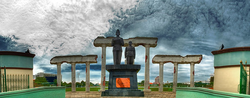 by Angga Andinata (xp08)
 by Antonius Teiseran (xp08)
Try to capture UNIQUE or seldom seen images of the city, avoid cliche images. However, it could be something often seen, but you depict it in a new or unique way.
It's subjective, and it's your personal perspective of the city. And you're allowed to manipulate/edit your images as you like them to be (such as using HDR, fake tilt-shift, color adjustments, or just natural or as is).
Pick TWO of your best pictures and print them to minimum 10R size prints, and paste them to a black hardboard/infraboard with 3 cm margins all around. TYPE the TITLE, YOUR NAME, and ID# on a label and paste it on each of your boards on the front bottom right corner.
WE'LL SELECT THE BEST ONES AND HANG THEM UP FOR A SMALL EXHIBITION ALONG THE DEPARTMENT HALL. There'll be a voting session to decide who's got the best photo, and deserves bonus points.
In general, the history of urban photography can be divided into two trends:
- depiction within a topographical approach (the distant gaze and the panoramic view)
- depiction of urban life at street level
To get you started on ideas about our city, here are some compiled terms that are often used to describe the modern city and urban life...
Posted by
apk
at
2:40 AM
|
![]()
![]()
Labels: photo exercise, topic, xp class
Thursday, May 15, 2008
The Decisive Moment & Playing Golf
 "Beruntung" ("Lucky") by Solahuddin of Jawa Pos
Although not all Henri Cartier-Bresson's photos capture that decisive moment, many do. Is it because of his long time experience? Or is he just a lucky guy?
Here's a short caption from Henri Cartier-Bresson’s book “The Decisive Moment” (1952). The decisive moment suggests a sense of perfect shutter timing to freeze action at its balanced composition. He wrote:
“To me, photography is the simultaneous recognition, in a fraction of a second, of the significance of an event as well as of a precise organization of forms which give that event its proper expression… Inside movement, there is one moment at which the elements in motion are in balance. Photography must seize upon this moment and hold immobile the equilibrium of it.”
For Cartier-Bresson, a photograph must not only freeze an instant of time, but it must also capture that instant within a well designed composition (Kobre, Kenneth. 2004. Photojournalism: The Professionals’ Approach. 5th ed. Oxford: Focal Press, p. 19.)
I see photographers getting that perfect decisive moment image as in sports. Golfers for example. There are lots of factors in getting that small ball into a small hole hundreds of yards away. There might be a "luck" factor in it, but I think mostly there are the experience and instuition factors. The experienced golfer has the feeling and intuition in how hard to hit the ball, which angle or direction to hit it against the wind, etc., etc. I'm not a golfer, but I think capturing that perfect and memorable decisive moment image is like getting a hole-in-one. Amateurs get lucky sometimes, but the maestros get "lucky" many times. So, actually it's not about being lucky but about practicing with effort in developing your intuition or instincts to be sharpened over time, having all your senses be open to your surroundings, and knowing what you want or what your goals are. There is just no shortcut for it, in sports or in photography, but through full-hearted practice, and time.
Posted by
apk
at
12:44 AM
|
![]()
![]()
Labels: decisive moment, topic
Wednesday, May 14, 2008
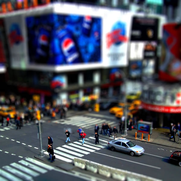
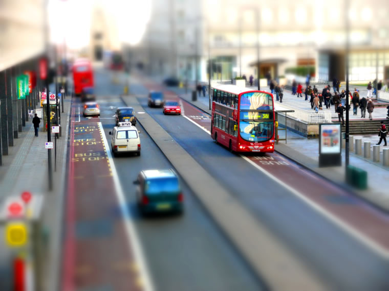
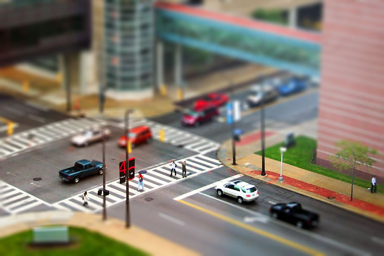
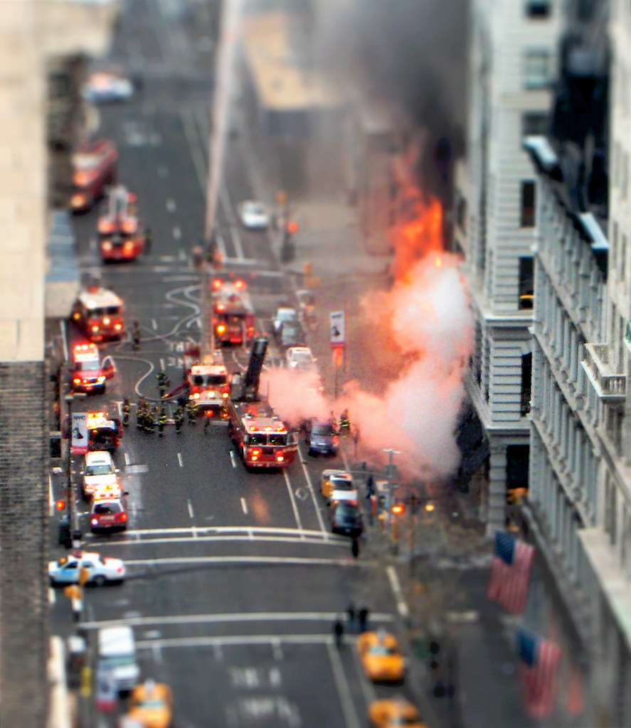
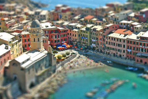
Is It a Miniature Model or the Real Thing? Introducing the "Fake Tilt-Shift" Effect
Got this from Chuck Green's ideabook...
The next time you see a photograph of a tiny little, toy-like model of a "real" scene, look again. It may not be a model at all, it may be the real thing edited using the "fake tilt-shift" effect in Photoshop ("real" tilt-shift is accomplished using a camera lens by the same name). The effect is achieved by changing the depth of field (among other things).
 by yongfook
 by automatt
 by yongfook
 by buteijn
recedinghairline.co.uk/tutorials/fakemodel/
Creating Fake Miniatures
Create a Faux Tilt Shift Effect in Adobe Photoshop Tutorial
Posted by
apk
at
2:58 AM
|
![]()
![]()
Labels: digital imaging, tilt-shift, tips
Photo Journal/Exercise 7: OCCUPATION - Perspectives/Points of View
Do a "short" documentary photography on a person with or at his/her job. Your pictures should reflect your perspective/point of view about your subject and/or his/her occupation.
This can be done individually or with a group of maximum 5 people per subject/occupation, with minimum of 50 shots/person.
Each person then makes a photo essay of 5 selected photos that can summarize the subject and the occupation and 3 written paragraphs about him/her and his/her occupation.
Give a main title for your documentary essay and titles for each of the five photos.
Only minor adjustments allowed, such as cropping, color adjustments, contrast adjustments, & sharpness.
Some tips for this assignment:
- show interest in the subject and the occupation, get to know the person and his/her part of life, troubles, likes/dislikes, etc. before the actual shooting session
- shoot portraits (portraitures)
- shoot candid portraits
- shoot sequences while the subject is doing the job (if fast, use continuous shooting)
- shoot extreme close-ups and close-ups to get his/her character, medium shots for the relationship of the subject to his/her job and surrounding, and long shots to capture the overall job environment
Posted by
apk
at
2:29 AM
|
![]()
![]()
Labels: documentary, photo exercise
Tuesday, May 6, 2008
Dynamic Photo HDR
 Another great HDR software you should try is the Dynamic Photo HDR by Media Chance.
It features cool capabilities such as manual alignment and anti ghosting masking. It also has great settings/methods for tone mapping among others.
Watch this short video about the more advanced Dynamic Photo HDR features in their latest version (v.3) which includes Light Tuner, B/W Mixer, Color-Correction, Match Color, Batch Processing and more:
Posted by
apk
at
5:34 PM
|
![]()
![]()
Labels: digital imaging, hdr
Friday, May 2, 2008
PROJECT 2 (DI): SUPER WORLD RECORD OF...
This idea was inspired & taken from the book Visual Literacy: A Conceptual Approach to Graphic Problem Solvingby Judith & Richard Wilde, a great book by the way on the subject. But I've improvised it here into a photographic digital imaging assignment.
The challenge is to illustrate, through PHOTOGRAPHIC DIGITAL IMAGING, a world record of any fact, statistic, deed, or achievement, in any field or subject area.
Consider the natural world, outer space, bizarre and outrageous stunts, challenging exploits, great sports accomplishments, or occurences that are ridiculous, provocative, or shocking.
Posted by
apk
at
3:34 PM
|
![]()
![]()
Labels: digital imaging, photo exercise
Tuesday, April 22, 2008
"Multi-Expose" by XP2007
 "Seven Kinds" by xp07 Kevin Winaldy (04)
 "Evalagus" by xp07 Yohan Ariel (04)
 Untitled by xp07 Heru Wibowo (04)
Posted by
apk
at
4:09 PM
|
![]()
![]()
Labels: digital imaging, photo exercise, surreal
Cartoons Untooned
I got this from trendhunter recently.. The artist used various textures of human skin and pieces of various faces to compose the image. The result is frightening impressive. Take a look at the making process of Jessica Rabbit below.

 Human cartoons are realistic interpretations of famous cartoon characters. In this case, we have Homer Simpson, Mario, and Jessica Rabbit in the flesh.
The artist, who goes under the name Pixeloo, writes on his website, “There isn’t really a strong reason I’m keeping this anonymous, I just kinda decided before I started that that’s how I wanted to do things. I work with Photoshop almost daily in my profession. I don’t feel like I get to have much fun with it lately though and this is my outlet.” 
Posted by
apk
at
3:09 AM
|
![]()
![]()
Labels: digital imaging, surreal
Thursday, April 17, 2008
How Will You Look in Four Years (When You're President)


- Cloned the eyebrows and moved them lower.
- Used the Liquify filter to hollow out cheeks, make jowls, thin out lips, and enlarge ears and noses.
- For Obama, painted in gray hair on top of his current hair; for Clinton, desaturated with the Sponge tool to make her grayer.
Then another usage of these public figures' faces with digital imaging I found in this really smart ad, coming out on perfect timing, utilizing the moment.

This reminded me of another DI exercise of blending faces to create virtual models or faces or beings, which creates something that also has surreal qualities to it. One of the samples of this process can be seen with the works of LA photographer Caesar Lima seen below. You should check out his blog, too, which shows lots of ads utilizing the powers of photography & digital imaging.
Posted by
apk
at
1:42 PM
|
![]()
![]()
Labels: digital imaging, surreal
Monday, April 14, 2008
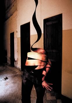
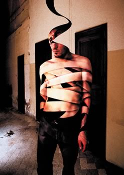
Works of Tetsuya Tamano
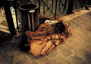
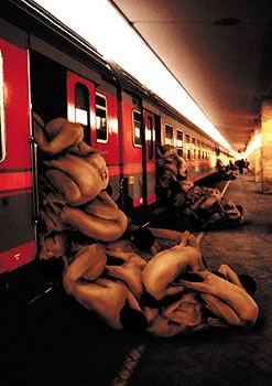
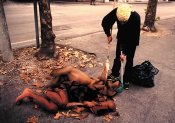
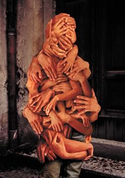
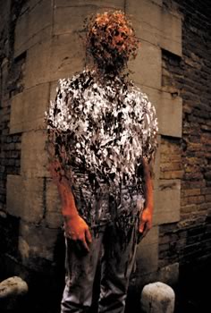
Here are some samples of the work of Tetsuya Tamano.
Tamano Tetsuya developed this body of work during his residency at Fábrica, Benetton’s communication research and development centre. When asked to develop a visual project to depict his view of contemporary society, Tetsuya came up with these strong and often disturbing images; he worked using digital technology, so as to better express his world views, and in keeping with Fábrica’s philosophy, in its role as an applied creativity laboratory (its name comes from the Latin word meaning workshop), of experimenting with new forms of communication.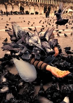
Posted by
apk
at
12:51 AM
|
![]()
![]()
Labels: digital imaging, profile, surreal
Wednesday, April 9, 2008
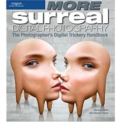
PROJECT 1 (DI): SURREALISM

- dreamlike (melancholic, horror,...)
- illogical (proportions, placement,...)
- unexpected (juxtapositions, combinations,...)
- absurdity
- element of surprise
- liberate imagination
At the top of this post are a couple of books for reference.
Other references you could find with the works of Salvador Dali (paintings), Rene Magritte (paintings), Alessandro Bavari, Maggie Taylor, and Domen Lombergar among others.
To see how DI has helped many ads visualize what they really want to communicate photographically, surf on to:
- Top 50 Shockvertisements - Controversial Ads (SUPER GALLERY)
- The Arab Aquarius blog
Posted by
apk
at
5:39 PM
|
![]()
![]()
Labels: digital imaging, photo exercise, surreal
Digital Creative Jeffrey Sebastian Lecture
 Visiting Lecturer Jeffrey Sebastian (2003 graduate of Petra's Visual Communication Design major /DKV'99), who's currently a digital creative freelancer, gave a showcase of his works yesterday in class, and revealed a recent project and case study from client Star Mild's ad agency. You can see his resume and some of his works on his site at creativetrees.com.
This will be followed later this semester by a three-day Digital Imaging seminar and workshop scheduled in the end of May. The event will bring in some of the top photographers and digital creatives from Jakarta to explain and demonstrate to us about the DI industry and also the whole process from planning to execution. The seminar will be open to the whole Visual Communication Design department. The 2-day-workshop, however, will be limited to the XP Class.
Posted by
apk
at
4:39 PM
|
![]()
![]()
Labels: digital imaging, profile, xp class
Wednesday, April 2, 2008
Fake InfraRed Photography: If you can't afford to Make one, Fake one
Not exactly a true IR, but it gives you a similar feel. Give it a try.
Posted by
apk
at
4:25 PM
|
![]()
![]()
Labels: digital imaging, tips, video
Alignment in Photomatix
I've found that Photomatix’s alignment wont work properly in itself. This means that the option below it, which is “Attempt to reduce ghosting artifacts” must always be checked also to get the best result. Like so...
Here is an example of alignment WITHOUT the Attempt to reduce ghosting artifacts:
And here's WITH the ATTEMPT TO REDUCE GHOSTING ARTIFACTS on:
Here are just a couple examples of HDR results. The first one is merged into HDR & Tonemapped in Photomatix, Photomerged/Stitched & finalized in Photoshop. The second is fully done in Photoshop.


Posted by
apk
at
3:19 PM
|
![]()
![]()
Labels: digital imaging, hdr, photomatix, tips


